Thursday, December 15, 2016

Senior Thesis #4 (More Development)

If you haven't been reading my previous blog posts, I am doing an art set on the Growth of Knowledge Through Technology. Technically, I am behind on this project because none of my panels have been completed for this project. However, I am nearly completed with all the drawing that will be doing for this project. The reason I am behind is because drawing realistically takes SO much time; especially when draw at such a large scale. The drawings should be able to fit two 18x24 panels and one 14x24 piece.  I have drawn out:

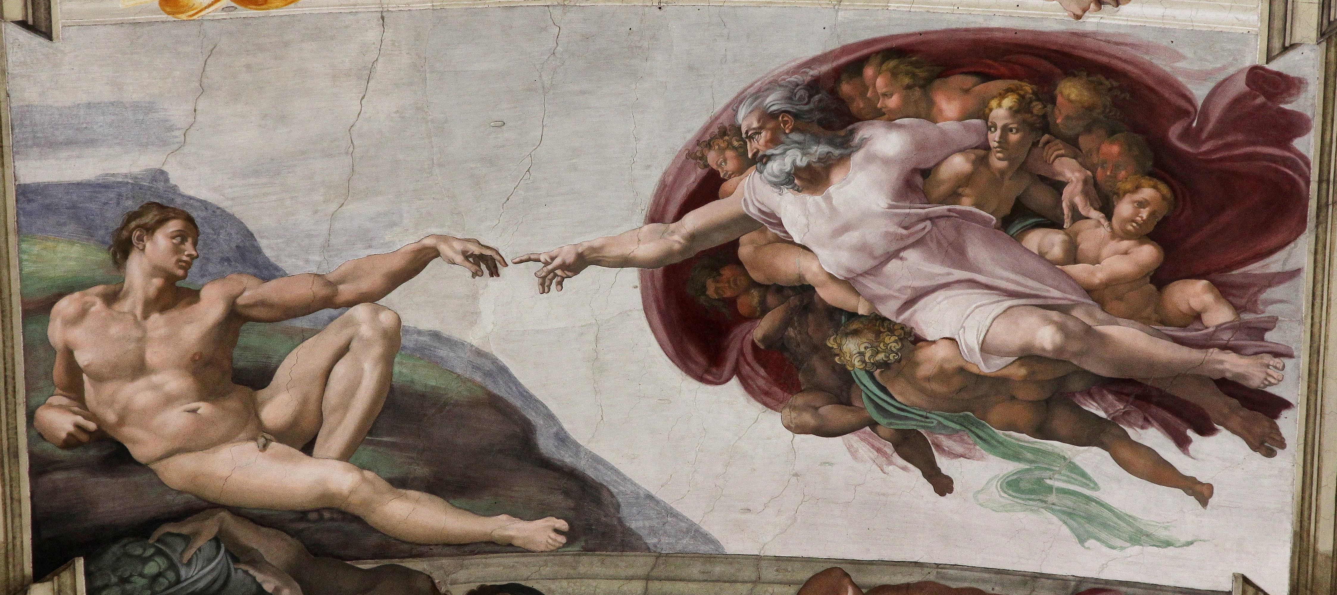
The Creation Of Adam Hands + Flashdrives


David
 

Self Portrait of Me On the Phone


Compared to my last plan, not much has changed in terms of what I expect on the final product. I still plan on keeping the "stacked" display concept. The thinnest piece, which is the Creation of Adam, will go in the center while the other two will be on the top and bottom. The top and bottom panels will be 18x24 and the middle panel will be 14x24, matted together. This will stick to a blue and green color scheme and the drawings will be cut and textured with a glitch-y style. 

Same as before, I'm still having trouble figuring out what the composition will look like for this artwork. I am very worried about making these into something that looks like a previous work of mine. I've gotten advice from Ella to put texture in the background to differentiate the background from objects since I wanted my background to be black but some of my objects may muddle in with the background. In terms of progression, I have thought of more skill-challenging aspects to include in this project such as creating that glitched effect by hand. I feel that including that in the work would really tie that in to my concept along with impressing my audience. However, I am most worried about not completing this project by the time 2nd semester rolls around because I am stepping into so many new territories doing this project and other assignments I have to balance with this work.

  • What other elements should I include that will make my work more unexpected?
  • Is the textured background a good concept? I was thinking about making the texture grainy and static-y but I am not at all familiar with the use of texture in works.
  • Should I take a break on the drawings and just get started on creating my objects and background? I feel as if I'm not making much progress compared to my peers when just working on the drawings.
Artistic References and Research
John Baldessari: My favorite conceptual artist. He uses art as a vehicle to push ideas. His work is more concept based than technical based but he has inspired me to make my art look a certain way.

Caleb Hahne: Colorado based artist, style very much embodies John Baldessari but is more technical and design based. His works reveal human perceptions throughout society and tackles a minimalist/contemporary feat.

Technology Enhanced Formative Assessment. (x)

The Role Of Communication Technology in Adolescent Relationships And Identity Development. (x)


Thursday, November 17, 2016

Senior Thesis #3 (Development)

So far in this project, I'm slightly behind as since this is a 1/3 project grade I should have 1 of the three pieces I am doing finished. I've only completed drawing the middle piece ( Creation of Adam hands) and an outline of the top piece. Size and technicality it certainly an obstacle in finishing this project. I am not used to creating large works, and I tend to work really slow when I draw realistically.


When my work is finished, there will be two 18x24 pieces and one 14x24 piece. These will be shown as a set stacked on top of each other. The colors I am using are blue, green, and purple. I know I have to be careful with the placement of the flash-drive as my group members did not like it always being in the center of each piece. I also know that I have to do something unexpected with the portraits and composition because I know it feels as if I have done something like this before. Therefore, I plan on giving the drawings a glitched effect, warping them as I draw each one. If not, I can always cut them so it looks glitched. At the moment, there are no difficulties in the design elements of my work (probably because it's too early to have problems). I am concerned with the sturdiness of my paper though; I am using 18x24 mixed media paper and I feel that it's too flimsy and not flat enough. With my independent project last year with the three pieces, I felt placing papercut on sturdy, flat surfaces worked better than with regular paper. I can attest to that since I did a papercut project in Ap Studio Art on flimsy poster board and it did not yield the results I was hoping for.


The only real issue I'm having is having the blue lines become more noticeable but I can always use oil pastels to push those colors.

-How should I approach the "glitching" effect with my drawings? Cut it or draw it?
-Should I switch to something sturdier to put my papercut drawings on? (I used acrylic paper for Culture Shop last year but it is unbelievably expensive) What surfaces do you recommend?

Artistic References and Research
John Baldessari: My favorite conceptual artist. He uses art as a vehicle to push ideas. His work is more concept based than technical based but he has inspired me to make my art look a certain way.

Caleb Hahne: Colorado based artist, style very much embodies John Baldessari but is more technical and design based. His works reveal human perceptions throughout society and tackles a minimalist/contemporary feat.

Technology Enhanced Formative Assessment. (x)

The Role Of Communication Technology in Adolescent Relationships And Identity Development. (x)


Wednesday, October 19, 2016

Senior Thesis #2 (Planning and Research)

Despite my skepticism on doing my thesis on the "Growth of Knowledge Through Technology", I decided to push forward with it. When any work is done about technology, it is put in a negative light. My thesis is about how our intelligence as a species has grown because of communication and educational technology; These are provided by computers, databases, and programs. Communication has allowed us to relay information to other individuals without having to physically see them. Educational technology has created a medium for individuals to attain information without the presence of an educator or the need for a library. I guess you could say this piece will be fueled by my annoyance with those who put down technology as a hindrance to humanity's growth. I also wanted to put out more artwork encouraging the advancement of technology; When my audience sees my work, they should understand its importance.  


(These are just some development sketches)


There are going to be 2 pieces: one depicting educational technology, and another communication technology. Both will be 18x24 on mixed media paper and will be purple, blue, and green. I have though a lot bout the symbolism in my art. I decided to put flash drives throughout my art  to represent information. The old statues represent the individuals who are "old-school" and see technology as objects that make us lazier. For my second piece about communication, I wanted to include a reference to the touching hands in the "Creation of Adam"(x). However, I feel like this painting has been referenced so much, that it has become cliche (especially in pop culture). I've also put in a series of out-put devices of a computer to show the medium where information is received.  I am unsure if I want to do my usual style of colored pencil and acrylic or do paper cut. While acrylics will allow me some control over the color, paper cut gives my artwork a cleaner look. On my summer project, I had points deducted for my craftsmanship because I decided to use acrylic. I am also unsure if I like the planning sketches I have. I'm not a huge fan of the planning process as my composition creates itself while I'm actually creating the art.

  •  How should I reference the "Creation of Adam" hands without being cliche? or should I reference it at all?
  • Will papercut be a better option for achieving a cleaner piece? 
  • How can I make this piece more relatable to my audience?
I've turned to Geiser C. Challco for researching the psychology behind learning and how technology has created an environment where learning is easier. (x)
I also reffered to Rodrigo B. De Carvalho on the "Knowledge Conversion Process". (x)
I've also discovered graphic design artist Asiaticool. I admire his illustration that utilize shapes and bright colors to create an interesting design. They are very reminiscent of the vaporwave style, which is the style I am going for in my art. (x)

Tuesday, September 27, 2016

Senior Thesis #1 (Planning and Research)

I am Archerd; the “d” in my name is not a typo. When it comes to preferences with art styles, I care more about the attractiveness of the piece rather than the technique and concept. I follow this same ideal when it comes to my work: beauty before anything else. However, I often cover topics pertaining to human/modern culture. 

      I am interested in exploring humanity’s growing intelligence because of technology. I am fascinated by how mankind has created equipment to cope with hindrances such as health, ignorance, and boredom. Unfortunately, these advancements are chastised by the public. Reasons for opposition: dissociation, change in sleeping habits, risk of privacy, and potential corruptive influence. While some points reign true, many are fallacious and often hypocritical. An example of hypocrisy would be: 
This photo has circulated the internet with captions crying out that the millennial generation lacks social skills. However, it has always been like this. 
The only difference is media and time period.

•What leads to derogatory behavior towards technology? 
•Why are we afraid development? 
•Was behavior like this present when emerging technologies in the past became widely used?


The sketches and planning for this project are coming along nicely. However, I am still having difficulty developing a composition. With this topic, it’s hard for the artwork to not look cliche. I am currently exploring technology in medicine and communication. 
Feedback I got the other day from my peers:
•Focus on relating it to humans
•Work bigger (I tend to work in smaller compositions; 9x12)
•Incorporate the “Vaporwave” style I had for my summer project. (see previous post)

This work is by Tom Haugomat. His works have a flat, graphic composition to them. His style appeals to me because his works are very technical yet very stylized.
https://www.behance.net/tomhaugomat

Should I stick with this concept? I find the topic interesting but it is not something I am passionate about. Also, I need suggestions for a better composition because I am struggling the most with figuring out how my art will look


Monday, September 26, 2016