Despite my skepticism on doing my thesis on the "Growth of Knowledge Through Technology", I decided to push forward with it. When any work is done about technology, it is put in a negative light. My thesis is about how our intelligence as a species has grown because of communication and educational technology; These are provided by computers, databases, and programs. Communication has allowed us to relay information to other individuals without having to physically see them. Educational technology has created a medium for individuals to attain information without the presence of an educator or the need for a library. I guess you could say this piece will be fueled by my annoyance with those who put down technology as a hindrance to humanity's growth. I also wanted to put out more artwork encouraging the advancement of technology; When my audience sees my work, they should understand its importance.

(These are just some development sketches)

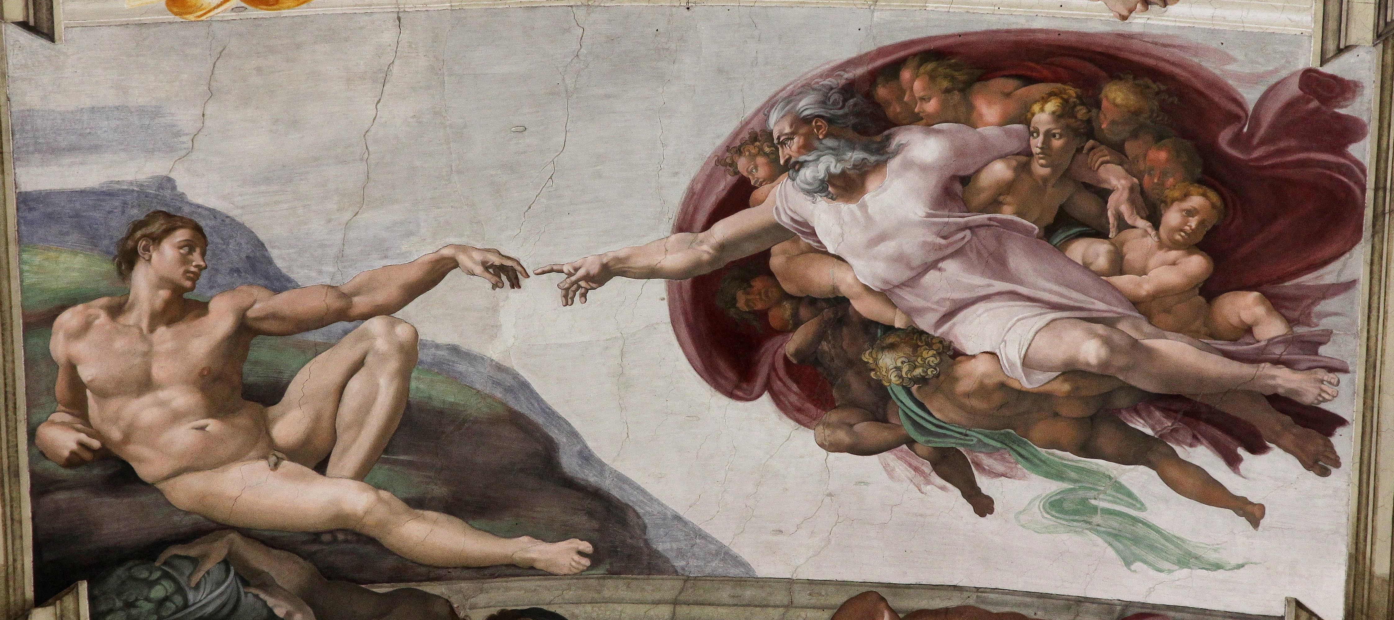
There are going to be 2 pieces: one depicting educational technology, and another communication technology. Both will be 18x24 on mixed media paper and will be purple, blue, and green. I have though a lot bout the symbolism in my art. I decided to put flash drives throughout my art to represent information. The old statues represent the individuals who are "old-school" and see technology as objects that make us lazier. For my second piece about communication, I wanted to include a reference to the touching hands in the "Creation of Adam"(x). However, I feel like this painting has been referenced so much, that it has become cliche (especially in pop culture). I've also put in a series of out-put devices of a computer to show the medium where information is received. I am unsure if I want to do my usual style of colored pencil and acrylic or do paper cut. While acrylics will allow me some control over the color, paper cut gives my artwork a cleaner look. On my summer project, I had points deducted for my craftsmanship because I decided to use acrylic. I am also unsure if I like the planning sketches I have. I'm not a huge fan of the planning process as my composition creates itself while I'm actually creating the art.
- How should I reference the "Creation of Adam" hands without being cliche? or should I reference it at all?
- Will papercut be a better option for achieving a cleaner piece?
- How can I make this piece more relatable to my audience?
I also reffered to Rodrigo B. De Carvalho on the "Knowledge Conversion Process". (x)
I've also discovered graphic design artist Asiaticool. I admire his illustration that utilize shapes and bright colors to create an interesting design. They are very reminiscent of the vaporwave style, which is the style I am going for in my art. (x)
No comments:
Post a Comment